Improving the checkout experience of the
SPORTS DIRECT APP
Overview
This case study was developed over a 4 month mentorship programme with UX Tree, during which we were asked to identify and research a UX problem within an existing website or app, and ultimately design a solution to the problem. I focused on the Sports Direct App (iOS version only).
My role
UX Researcher, UX/UI Designer
Duration
4 months
The problem
The checkout process on the Sports Direct App is both complex and laborious. Initial assumptions and preliminary research suggest its accordion-style design is causing confusion for users as they navigate through the process. Further areas of frustration include the inability to edit items in the checkout basket, difficulty inputting and editing the delivery address, along with security concerns on payment.
The opportunity
Every extra action performed during checkout reduces the likelihood of the customer completing a purchase. There is an opportunity to make the process quicker, more streamlined and focused on the primary goal: to facilitate a hassle-free purchase. Simplfying the process will lower checkout abandonment rates, increase conversion rates and ultimately boost sales revenue for Sports Direct.
The process
Double diamond.
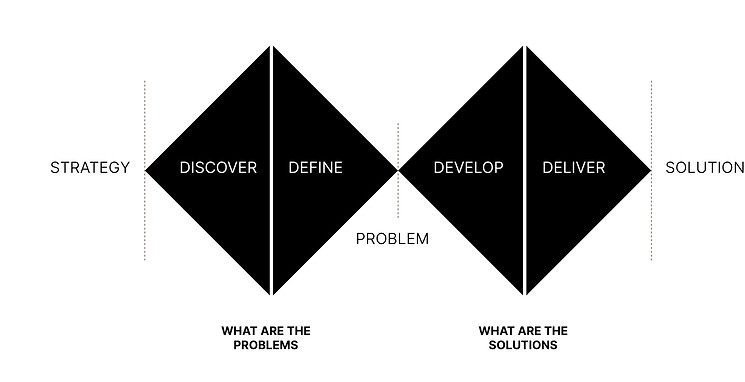
01. DISCOVER
Research Objectives:
-
Review the characteristics of an effective checkout flow and pinpoint where the Sports Direct app is not meeting this criteria.
-
Understand how important security on payment is to users and reaffirm initial assumptions that there are security concerns at the payment stage of the Sports Direct App.
-
Investigate if the app's inability to edit items at checkout will be an expectation and indeed a source of frustration to the user
-
Determine if the inability to edit a delivery address once it has been inputted is contributing to the complexity of the checkout process.
Literature Review
Firstly, I needed to understand the underlying factors to an effective checkout flow. I researched and analysed articles and reports on checkout usability and composed an executive review on the findings. The review unearthed some key insights:
-
Users should be allowed to edit their items at the checkout stage. Best practice is via inline form fields or page overlays.
-
'Guest Checkout' should be a prominent option at log-in. Forcing a registration often breaks the buying process. Once the user takes the initiative to make a purchase the checkout process should be as easy and fast as possible.
-
A single screen checkout generally leads to higher conversion rates. When customers get to see all the checkout steps on a single screen, they know where they are heading. Customers will find it easier to navigate through the entire flow and complete the purchase without a hitch.
-
User perception of security is mainly down to their “gut feeling”, and largely determined by how visually secure the screen looks. A smooth, secure, and transparent checkout process addresses these concerns about security and privacy, reinforcing the customer's confidence in the brand.
Heuristic Evaluation
The next step was to carry out a heuristic evaluation of the current state of the checkout process of the Sports Direct app in order to ascertain what heuristics were in danger of being violated. It was also good preparation for upcoming usability testing to identify elements that should be targeted in the sessions.
Findings
-
The accordion checkout design is inline with checkout optimisation recommendations but is not working effectively and causing disorientation to the user leading them to exit the funnel when attempting to go back a step in the process.
-
The shopping bag area does not immediately resonate as a ‘shopping bag’ and does not contrast well against the header so has the potential to get overlooked.
-
By not allowing the user to easily edit the shopping bag and delivery address the heuristic 'Freedom of control' in particular is being disregarded. The user should have the ability to always undo actions, change their mind about decisions, and fix any errors.
Heuristic Evaluation
Competitor Analysis
A competitor analysis was carried out on three well known brands - Nike, Adidas, and JD Sports (IOS versions of the apps only). This was a great way to study and analyse the competition's strengths and weaknesses, observe UX trends in the checkout flow and leverage that information when it came to the design stage. The apps were categorically analysed by Account Registration/Guest Checkout, Delivery Method, Delivery Address, Shopping Cart and Payment.
Findings
-
Adidas and Nike offer log in via Apple to streamline and shorten the checkout experience by pre-loading personal details.
-
The checkout design of Adidas and Nike is in the form of a page overlay over the shopping bag so the user still has to exit the funnel in order to edit items.
-
Overall, the checkout of both Adidas and Nike is a sleek design with minimum options, keeping the cognitive load on the user quite low and paving the way for a fast checkout.
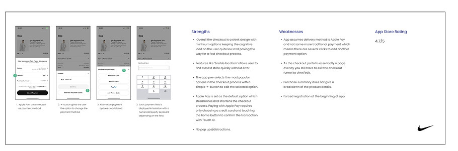
Competitor Analysis - Nike
Usability Testing
I ran 3 usability sessions on the Sports Direct app and set the users two tasks once they had entered the checkout funnel - updating the delivery address to a new address and changing the size of their item in the cart. The sessions validated initial concerns surrounding navigational and user control and freedom when editing both the address and cart.
Findings
-
3/3 users prefer to sign in via Apple as it auto-loads personal details.
-
3/3 users expect to be able to edit items at checkout stage.
-
It took one user 5mins 10 seconds to insert a new delivery address, this was due, in part, to Irish addresses defaulting to UK addresses.
-
Testing undressed some key navigational issues with the accordion style design. 1 user exited and re-entered the checkout funnel 3 times when attempting to get from the delivery address section to the payment section because 'at least now I know where I am'
-
All 3 users felt secure inputting their credit card details.
RESEARCH SUMMARY
-
The accordion style design is not working effectively and needs an overhaul. Users are clearly confused as to what stage they are in the checkout process, particularly when trying to progress from the delivery address to payment section and rely on exiting and re-entering the funnel to get their bearings.
-
Surprisingly, security on payment was not a source of concern to any of the users during the testing phase. This was a key research objective mainly due to the lack of card/security logos on the app's payment page. The findings in the literature review put security down to user perception so the lack of concern from the user alleviated any concerns surrounding the payment screen.
-
The goal is to make the user experience as simple and easy as possible, so inputting and editing the delivery address needs to simplified.
-
It's crucial to let users easily edit their cart to minimise friction during the shopping experience. If they make a mistake, they shouldn't have to restart the entire process, as being forced to do so can significantly diminish the likelihood of completing the purchase.
02. DEFINE
Affinity Diagram
An affinity diagram was created in order to put some structure on the user opinions, user needs, insights and design issues collected from the previous stage.
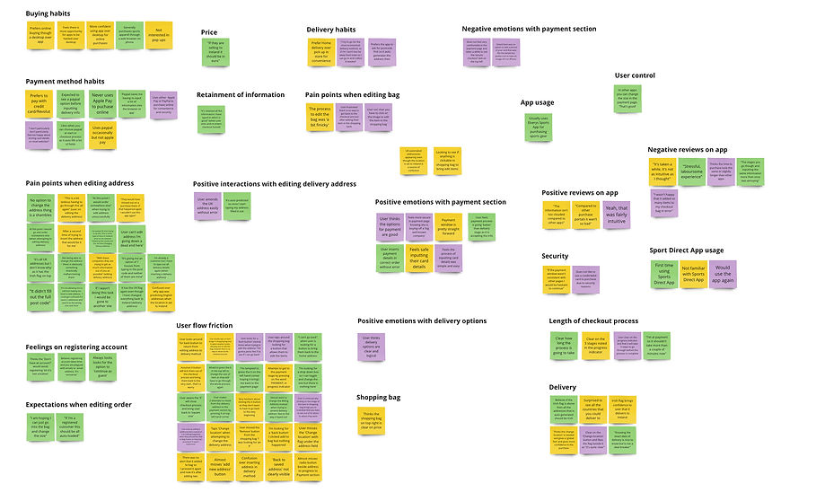
Affinity Diagram
User Persona
At this stage all insights gathered during the discover phase were analysed and initial assumptions were refined to create a user persona and empathy map.
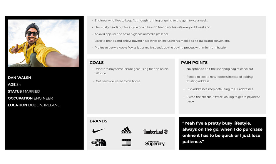
User Persona
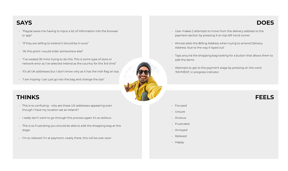
Empathy Map
Customer Journey
The customer journey map was built from the persona's perspective as they navigate the checkout from the registration screen right through to order confirmation. By viewing the product from the user’s perspective, it was clear where the pain-points and stumbling blocks lie within the user experience.
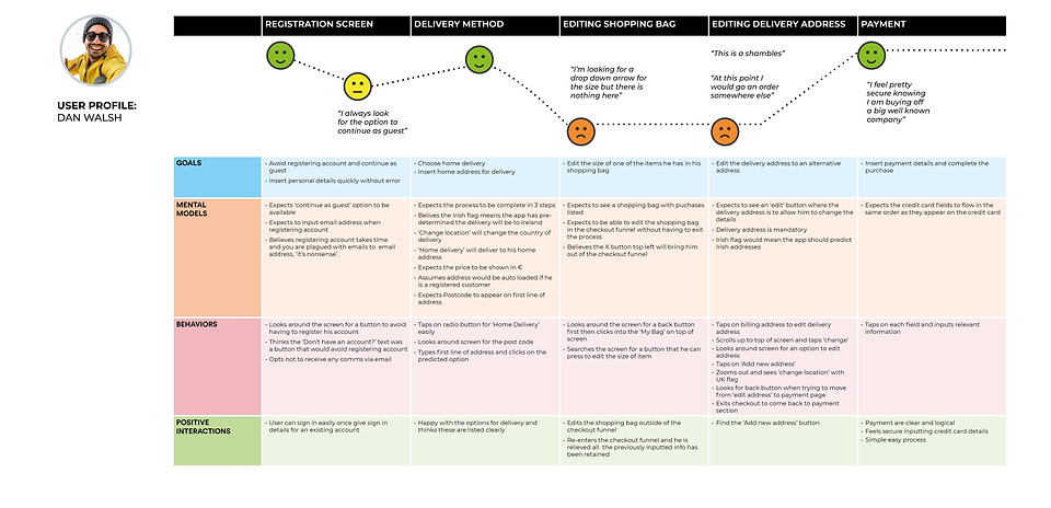
Customer Journey Map
Problem Statement:
How might we improve the check out flow of the Sports Direct App to reduce user frustration therefore lowering abandonment rates, raising conversion rates and increasing customer retention.
03. DEVELOP
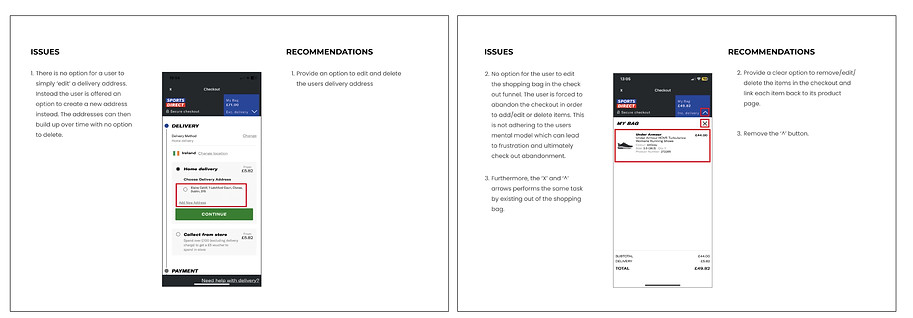
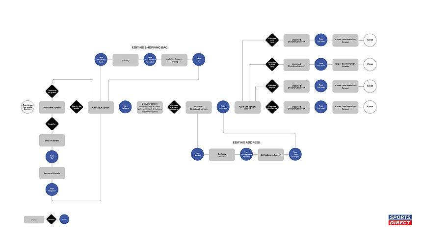
User Flow
At this stage it was important to map out the flow of the existing app to help determine what’s working, what’s not, and what areas need improvement. The user low was the last audit on the existing app and mapped the point of entry from the 'Continue Securely' button from the shopping cart to the exit point of the 'Order Confirmation' screen.

Existing User Flow
Observations
-
A need for additional log in options i.e. Apple for iOS users.
-
Continue as guest should be a prominent option at log in as opposed to forced registration
-
Users should have the option to edit the shopping bag at checkout.
-
Allow users to edit the delivery address instead of being forced to input a new one.
-
The 'Change location' option under Delivery Address section is needless and a source of confusion within in the journey.
Suggested User Flow
Initial Sketches
The next step was to sketch out some basic ideas to consider the problem from different angles and to consider different solutions.
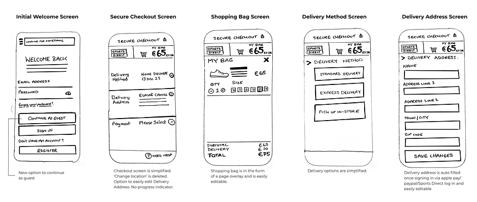
Initial Sketches
04. DELIVER
High Fidelity Prototype
A high fidelity prototype was then designed with to vet the new user flow and get the product into the testing phase.
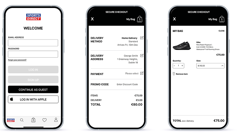
High Fidelity Screens for first round of testing
Usabaility Testing
3 more usability sessions were completed where users were asked to perform the same two tasks as the first round of testing on the existing app - editing the delivery address and shopping cart. Each of the tasks were designed to test the user flow, UI and usability of the prototype.
Outcomes
-
3/3 users performed both tasks quickly without any friction.
-
2/3 users expected to see a large 'Payment' button on the main checkout screen and did not think it was obvious where it was positioned.
-
1 user was unsure if the size of the item had changed and would have liked to see clarity on the change in terms of a product summary.
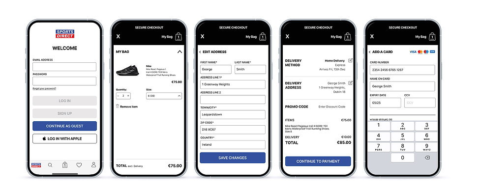
Final Prototype
Taking on board the comments of the users I revisited the checkout flow making the payment button more visible and included a summary of the product above so it's clear what the user is purchasing.
Results
-
The checkout journey was redesigned and simplified into three key areas - Delivery Method, Delivery Address along with a field for a Promo Code.
-
Additional log in options for Apple alongside an option to Continue as Guest were implemented into the log in screen.
-
Editing the address is now a very simple task for the user
-
The shopping cart is now editable, allowing users to edit the quantity/size/colour and delete an item from the cart if desired without having to exit the checkout funnel.
-
The UI was modernised but kept simple so as not to distract, allowing the user to 100% focus on the task at hand.
Reflection
I would definitely run more usability tests on the current prototype as I found the testing phase incredibly insightful and instrumental in improving the overall flow of the app. I would perhaps revisit and enhance the UI interface also.
I focused on the iOS version of the Sports Direct App but would love to create an Android version too, implementing a Google log in and a Google Pay payment option.
Overall the project has opened my eyes to the importance of a good checkout flow and how critical a role it plays in sales revenue. An intuitive and hassle-free checkout flow streamlines the path to purchase, removing any potential obstacles or frustrations. And as we well know, if the customer don’t complete the purchase, none of the rest really matters...